SRG Update #5
Sorting still a bit screwy

xxBlazeGuy420xx is a fine name – what could go wrong?
So this week marks a new milestone, one I’ve been looking forward to for quite awhile:
The BIS MVP is done!
Which means what? Well, “minimum viable product” (MVP) means different things to different folks, depending on what it is that’s being developed. In this case, the ‘folk’ is me, an indie game developer working towards shipping his first product.
For that guy, the single most important thing is to have a game that is on my phone and playable. This serves two purposes:
- I can start the critical process of gathering feedback from people around me, and
- It serves as tangible proof of progress
The first is self-explanatory. The second is a consequence of how I’m building this: as a side-project while I work a full-time job. Significant sacrifices are being made each week to move this project forward, and I need to feel I have something to show for it.
Finalizing what I’ve been calling “the phone demo” meant spending most of this week working on cleaning up the UI for phone use. I think I’ve finally got a handle on how to build a proper resolution-agnostic app in Unity, so yay for that.
It also meant fixing some critical bugs and adding a few important “I’m a real game!” UX/quality of life aspects. I’ll just bullet list these:
- You can enter a name for your character.
- You can change the active character without forcing the game to close.
- You now earn a little bit of money for clearing your own blocks, a sort of “recycling” bonus.
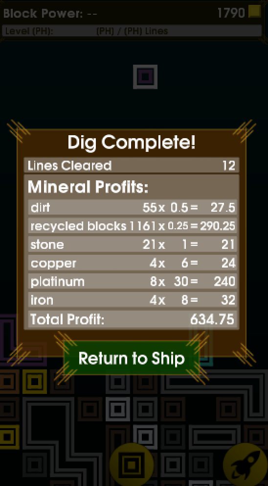
- When exiting mining mode, you now get a more complete list of results, including “grassy dirt” and your own blocks.
I decided towards the end of the sprint that finishing the tutorial is really not that critical, just yet. The game right now is fairly straightforward, except for how multi-clear leaves blocks behind. I expect that will become more intuitive with additional visual cues.
OK, enough about last week. What does the future hold?
This week, I’ll be spending a fair bit of time nailing down which high-impact, high-fun features I want to get in place for the F&FA (Friends and Family Alpha). I have two main goals, here:
- Try to capture the first real “spark of fun”, and
- Start getting some feedback on whether I’m on the right path
New Feature: Block Inventory
“Spark of Fun” work this week will primarily be the “block inventory”.
Right now, each round, you get a random piece from a list of 1- to 7-square blocks. I will replace this with something similar to deck building in a CCG.
The high-level explanation is roughly as so: You start with a set of blocks in your inventory. While on your ship, you create/customize a set of blocks. Then while mining, each round your next block is selected from that set. Each block has its own traits, for now Color and Power. You can tweak the frequencies of each block a little bit (the big 7-square ‘U’ shape is brutal), but for the most part you have to make do with what luck hands you.
As you play, you can acquire new blocks, using them to change your set of blocks, and make gameplay fit your style more.
For the time being, there’s little reason to use the larger blocks – they’re mostly a pain in the ass, a hurdle to overcome. In a later sprint, I hope to introduce some sweeping changes to the core gameplay that will give the large, opinionated blocks a place in some players’ arsenal.